
Colours and presets
Updated November 9, 2026
These settings are in the Look card of Form Settings → KodaSteps.
Style preset
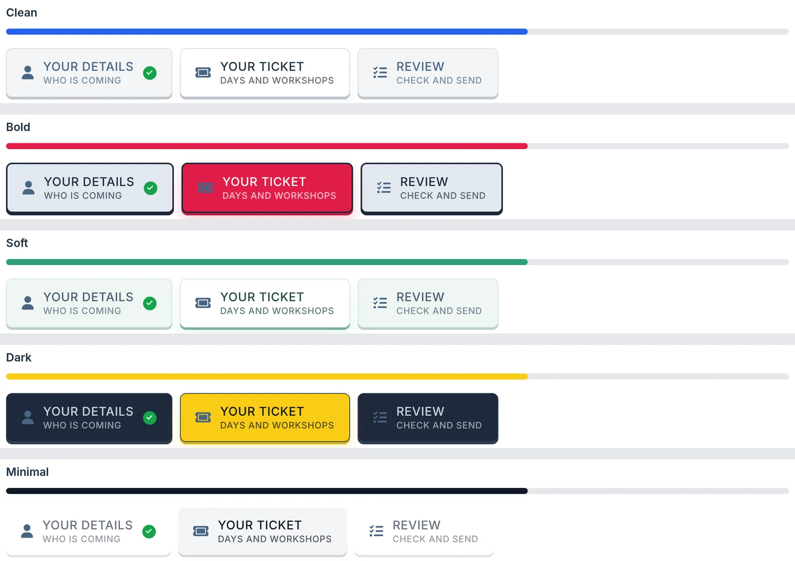
Choose Clean, Bold, Soft, Dark or Minimal and the colour boxes, border width and progress bar colours below fill in to match. They stay editable, so pick the closest preset and adjust it. Custom (my own colors) leaves the boxes as they are. Click Save Settings to keep the result.
Use the form theme’s colors
Tick this to follow the colours set for the form in Gravity Forms’ Orbital theme (Form Settings → Form Style, or the form block’s style settings). The open step, hover border and progress bar use the theme’s primary colour; the other steps use its secondary colour. Wherever the theme sets no colour, the colours below are used instead.
Font, text size and border
| Setting | What it does |
|---|---|
| Font | Any CSS font name your site already loads, for example Georgia, serif. Empty uses the form’s font. |
| Text size | 10 to 36 pixels. Default 16. |
| Border | The steps’ border width, 0 to 12 pixels. Default 1. |
Colours for each state
Three columns set the text, background and border colours of the steps in the step bar: Normal, Mouse over and Current step (the open step). Type a hex colour or use the picker. The arrow button next to each colour resets it to the default.
CSS classes
Each column also has a CSS class box for your own styling:
- Normal: added to every step button.
- Mouse over: also added to every step button. Style it with
:hoverin your own CSS, for example.my-step:hover { … }. - Current step: added only to the open step, and moves as the visitor moves.
For everything else KodaSteps adds, see CSS classes.
My theme already loads Font Awesome 6
KodaSteps includes Font Awesome 6 Free for icons and loads it only when the form shows icons. If your theme or another plugin already loads Font Awesome 6, tick this so it isn’t loaded twice. If icons then show as empty squares, untick it.
Thanks for letting us know.