
Field settings
Updated November 10, 2026
Every field that uses KodaChoices has a KodaChoices section in its settings, below General, Appearance and Advanced. Click the field in the form editor, then open the section. Settings that don’t apply to the field (for example Pattern outside Swatch mode) are hidden.
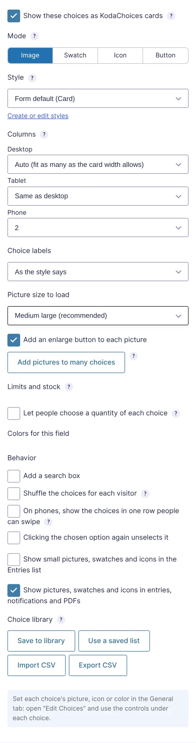
Main settings
| Setting | What it does |
|---|---|
| Show these choices as KodaChoices cards | Turns KodaChoices on for the field. Untick to go back to Gravity Forms’ own choices; every other setting is kept. On Image Choice fields it’s on by default (see Gravity Forms Image Choice fields). |
| Mode | What each card shows: Image, Swatch, Icon or Button (label only). See Display modes. Image Choice fields are always Image. |
| Style | The look of the cards. Form default uses the form’s default style. Create or edit styles opens the style library in a new tab. See Styles. |
| Columns | Cards per row on desktop, tablet (below 1024 px wide) and phone (below 640 px). See Columns, phones and tablets. |
| Choice labels | As the style says, Show, or Hide. Hidden labels are still read out by screen readers. Useful for swatch or picture-only grids. |
Mode settings
| Setting | Shown in | What it does |
|---|---|---|
| Picture size to load | Image | The WordPress image size used on the form. See Pictures. |
| Add an enlarge button to each picture | Image | A magnifier on each picture that opens it full size. |
| Add pictures to many choices | Image | See Adding pictures to many choices. |
| Pattern for every choice, Pattern size | Swatch | See Swatches. |
Rules and behavior
| Setting | What it does |
|---|---|
| How many can be chosen (Checkboxes only) | At least and At most, plus an optional counter. See How many can be chosen. |
| Limits and stock | Limits, “N left”, resets and one per person. See Limits and stock and One per person. |
| Let people choose a quantity of each choice | A − / + stepper on chosen cards. See Quantities. |
| Colors for this field | Colors that override the style for this field. See Colors for one field. |
| Add a search box | A box above the cards (or in the dropdown) that filters choices as visitors type. See Search, shuffle and group headings. |
| Shuffle the choices for each visitor | Mixes the order each time the form loads. |
| On phones, show the choices in one row people can swipe | Below 640 px wide, the cards sit in one row that scrolls sideways. |
| Clicking the chosen option again unselects it (Radio Buttons only) | See Buttons. |
Entries and emails
| Setting | What it does |
|---|---|
| Show small pictures, swatches and icons in the Entries list | Off by default. See Entries and the Entries list. |
| Show pictures, swatches and icons in entries, notifications and PDFs | On by default. Untick to show plain text answers there. |
Both are hidden in Button mode, which has nothing to show.
Choice library
Save to library, Use a saved list, Import CSV and Export CSV. See Choice library and CSV files.
Hover the ? next to a setting for a short reminder of what it does.
Was this page helpful?
Thanks for letting us know.