
Settings for each choice
Updated November 10, 2026
Each choice has its own KodaChoices settings, right under it in Gravity Forms’ Edit Choices list (General section → Edit Choices). The top row depends on the mode; Label extras is the same in every mode.
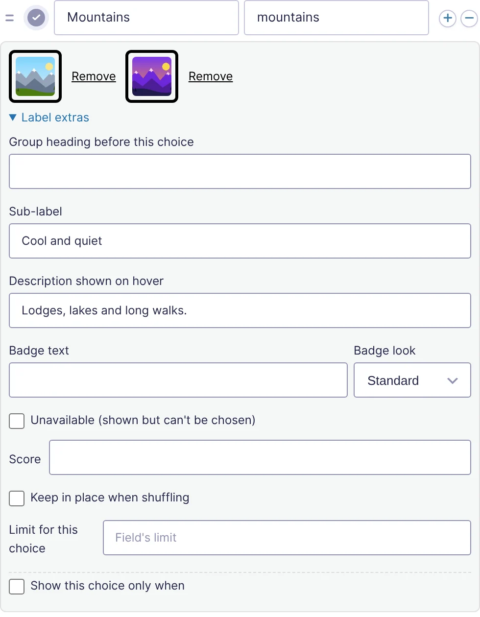
The top row
| Mode | Controls |
|---|---|
| Image | Picture and Hover picture. See Pictures. |
| Swatch | Color, Second color and Pattern. See Swatches. |
| Icon | Icon, Upload SVG, Icon color and Background. See Icons. |
| Button | Nothing: the label is the button. |
Label extras
Click Label extras to open it. It opens by itself on choices that already use any of these.
| Setting | What it does |
|---|---|
| Group heading before this choice | Text shown as a heading on its own row before this choice, to split long lists into groups (for example Hot drinks before the first hot drink). Leave empty for no heading. |
| Sub-label | A second, smaller line under the label, such as a size, time or short note. |
| Description shown on hover | A short tooltip that appears when a visitor hovers the card or reaches it with the keyboard. Screen readers read it with the choice. |
| Badge text and Badge look | A small badge on the card, such as Popular, New or Sale. The look sets its colors: Standard, Popular, New, Sale, Sold out or Selected color. Its position and corners come from the style. |
| Unavailable (shown but can’t be chosen) | The card shows faded and can’t be picked. It’s checked again when the form is sent. Use it for things that are temporarily out. For automatic sold-out, use a limit instead. |
| Score | A number used by kc_score merge tags. See Scores. |
| Keep in place when shuffling | This choice doesn’t move when the field shuffles. Not shown for drop downs. |
| Limit for this choice | How many times this choice can be picked across all entries. Empty uses the field’s limit. See Limits and stock. |
| No quantity (always 1) (only when the field has quantities on) | This choice gets no − / + stepper and always counts as 1. See Quantities. Not shown for drop downs. |
| Clears the other choices (like “None of the above”) (Checkboxes only) | See “None of the above”. |
| Show this choice only when | Rules that decide when the choice appears. See Showing a choice only when…. |
Gravity Forms’ own parts of each choice (label, value, price, the default-choice tick, the + and − buttons and dragging to reorder) work as usual. A label or sub-label can include earlier answers, such as Room for {Name:1.3}; see Labels with earlier answers.
Changes under each choice show in the form editor’s preview straight away, like Gravity Forms’ own settings. Click Save Form to keep them.
Was this page helpful?
Thanks for letting us know.