
Styles
Updated November 10, 2026
A style is a saved look for cards: shape, outline, shadow, picture shape, text, the selected look, the tick and badges. You make styles once and use them on any field of any form. One style covers every mode, so the same style can show pictures, swatches, icons or buttons.
Where styles live
Open any form, click Settings, then the KodaChoices tab. It has four panels:
| Panel | What it’s for |
|---|---|
| This form | This form’s default style, and a table of the form’s KodaChoices fields with each one’s mode and style. |
| Style library | Every style on the site: edit, copy, export, delete and choose the site default. Also New style (start from a preset) and Export and import. |
| Choice library | Saved lists of choices. See Choice library and CSV files. |
| Site settings | The Image Choice takeover. See Gravity Forms Image Choice fields. |
Styles are shared by every form on the site, whichever form you open them from.
Which style a field uses
- The style picked in the field’s Style setting (form editor → KodaChoices section).
- If that’s Form default: the form’s default style.
- If the form has none: the site default style.
Set this form’s default style
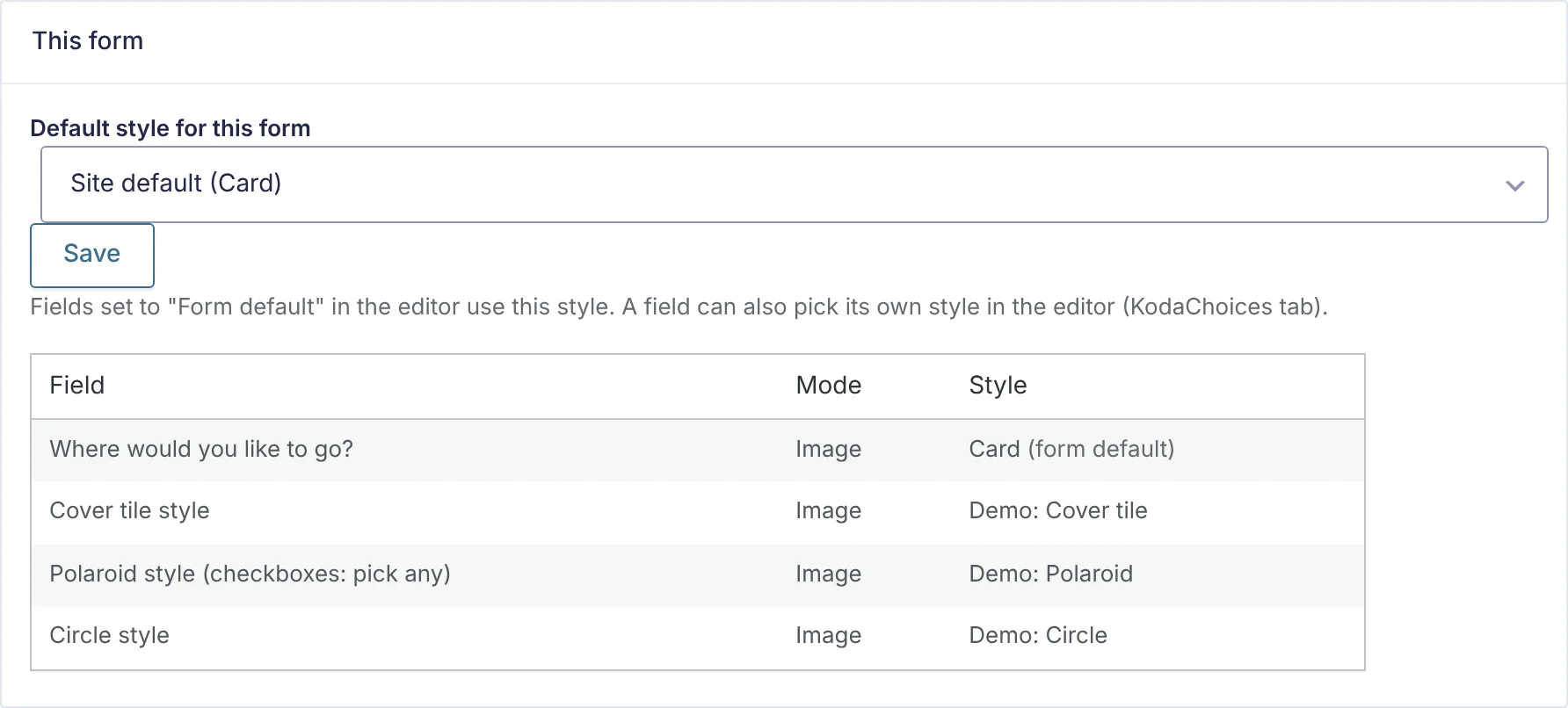
- Under This form, pick a style in Default style for this form. Site default follows the site’s default style.
- Click Save.
The table underneath lists each KodaChoices field, its mode and the style it ends up with; (form default) marks fields that follow the form’s default.
The style library
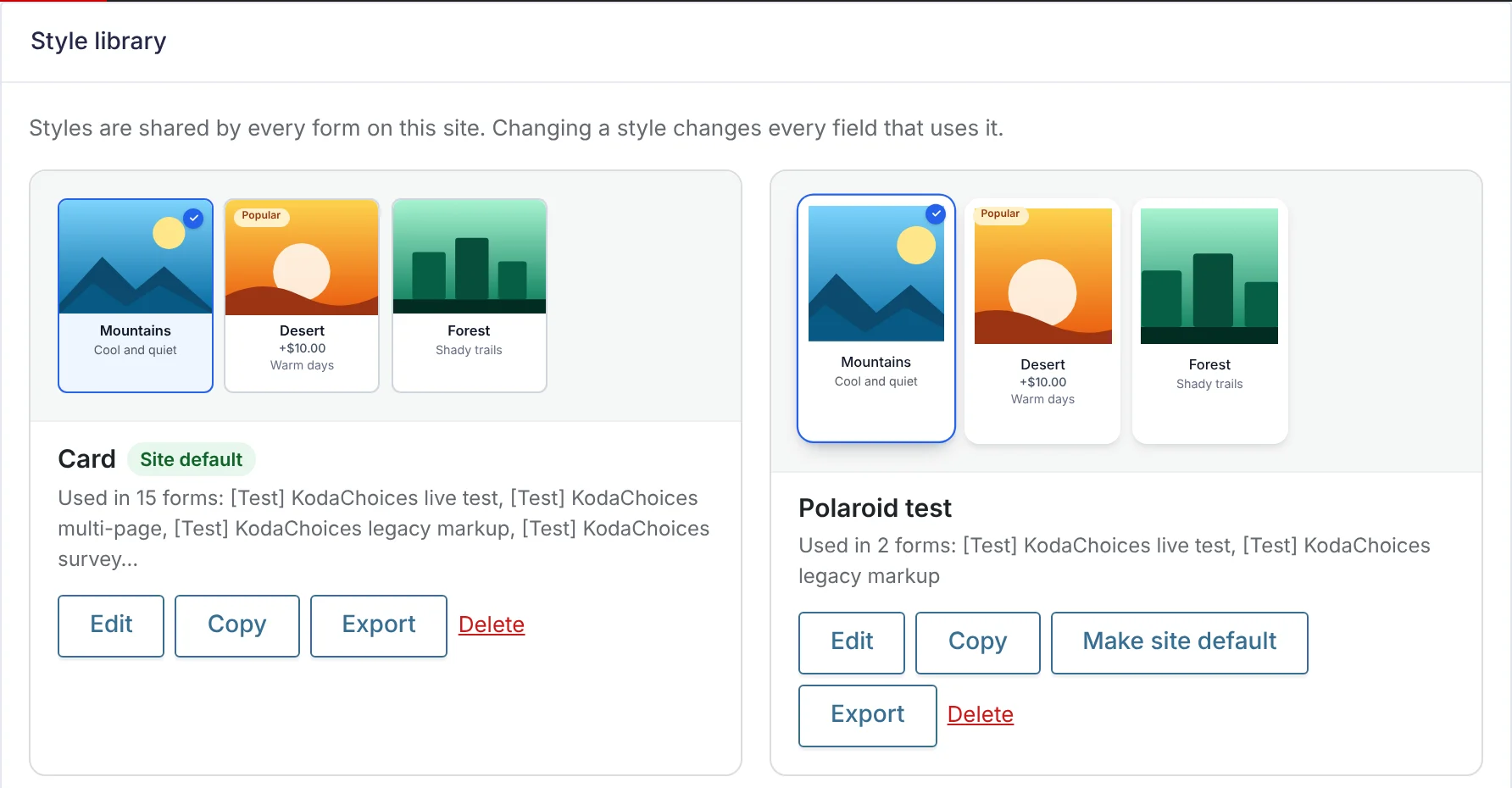
Each style card shows a preview, which forms use it (Used in 2 forms: …) and these buttons:
| Button | What it does |
|---|---|
| Edit | Opens the style in the Style Builder. |
| Copy | Makes a copy named … (copy) and opens it, so you can try changes without touching fields that use the original. |
| Make site default | Makes this the style used when neither the field nor the form picks one. The current default shows a Site default label. |
| Export | Downloads this style as a .json file. See Export and import styles. |
| Delete | Deletes the style after you confirm. Fields that used it switch to their form’s default style. The site always keeps at least one style. |
The first time KodaChoices runs, the site gets one style, Card, as its default.
Start a new style
Under New style, click a preset. It opens in the Style Builder with the preset’s settings; change anything, name it and click Save style.
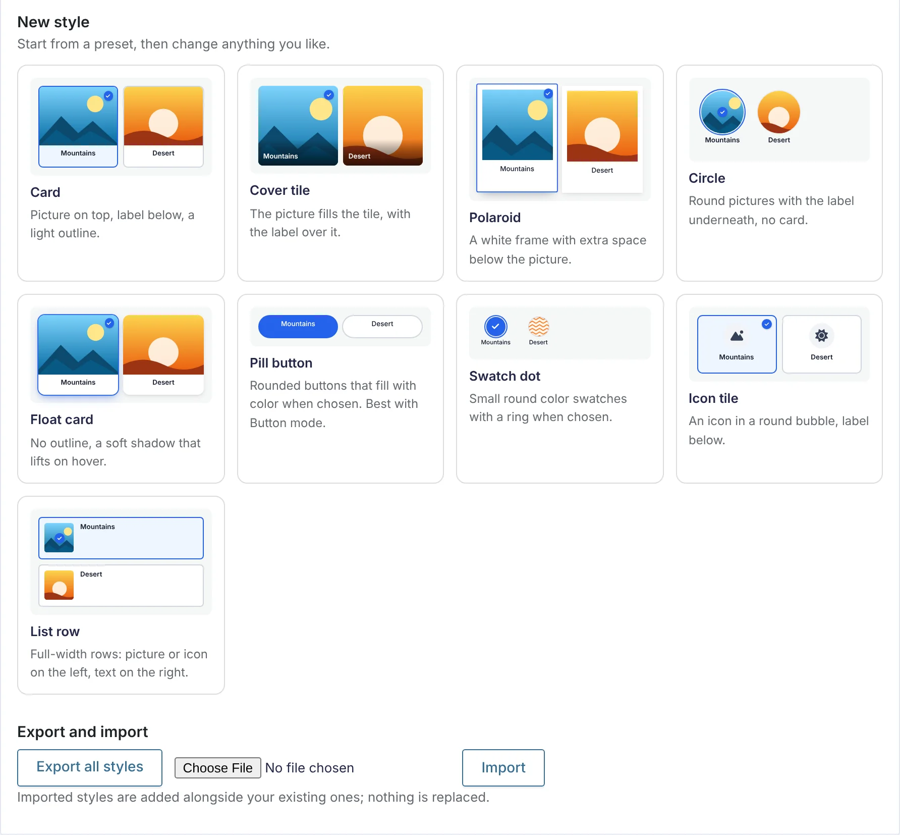
| Preset | Look |
|---|---|
| Card | Picture on top, label below, a light outline. |
| Cover tile | The picture fills the tile, with the label over it. |
| Polaroid | A white frame with extra space below the picture. |
| Circle | Round pictures with the label underneath, no card. |
| Float card | No outline, a soft shadow that lifts on hover. |
| Pill button | Rounded buttons that fill with color when chosen. Best with Button mode. |
| Swatch dot | Small round color swatches with a ring when chosen. |
| Icon tile | An icon in a round bubble, label below. |
| List row | Full-width rows: picture or icon on the left, text on the right. |
A preset is only a starting point. Changing a style later never changes the preset, and the other way round.
Thanks for letting us know.