
How to Add Image Choices to Gravity Forms (with Stock Limits)
Updated November 10, 2026 · 4 min read
Radio buttons and checkboxes work, but they don’t sell. When people are choosing a T-shirt color, a room, a workshop or a product, a picture or a swatch tells them more than a label ever can.
This guide covers Gravity Forms’ own Image Choice field, styling choices with CSS, and how to get picture cards, color swatches, icons and stock limits on the fields you already have.
What Gravity Forms can do on its own
Since version 2.9, Gravity Forms includes an Image Choice field. You add it from Standard Fields, give each choice an image from the Media Library, and decide whether visitors can pick one choice or several. The Gravity Forms block lets you set the appearance, style and size of the images.
It’s a good start, with a few things to know:
- It’s a separate field type. To add pictures to a Radio Buttons or Checkboxes field you’ve already built, you add a new Image Choice field and move your choices over.
- Images uploaded through the field are cropped to a square.
- It’s about pictures. There are no color swatches, icons or button-style choices, no “only 3 left” counts, and no limits on how many times a choice can be picked.
Styling choices with CSS
If you only want radio buttons side by side, Gravity Forms’ CSS ready classes and a few lines of custom CSS will lay choices out in columns or inline. Real cards with pictures, hover effects and a selected outline need more CSS than most people want to maintain, and they still can’t stop a choice from selling out.
The no-code route: KodaChoices
KodaChoices turns the Radio Buttons, Checkboxes and Multiple Choice fields you already have into cards. Each field can show:
- Pictures, with an optional second picture on hover and an enlarge button.
- Color swatches, including patterns.
- Icons or plain buttons.
- A visual dropdown, for long lists.
The real radio buttons and checkboxes stay underneath, so the form saves, validates and sends exactly as before. Your existing Gravity Forms Image Choice fields are picked up automatically too.
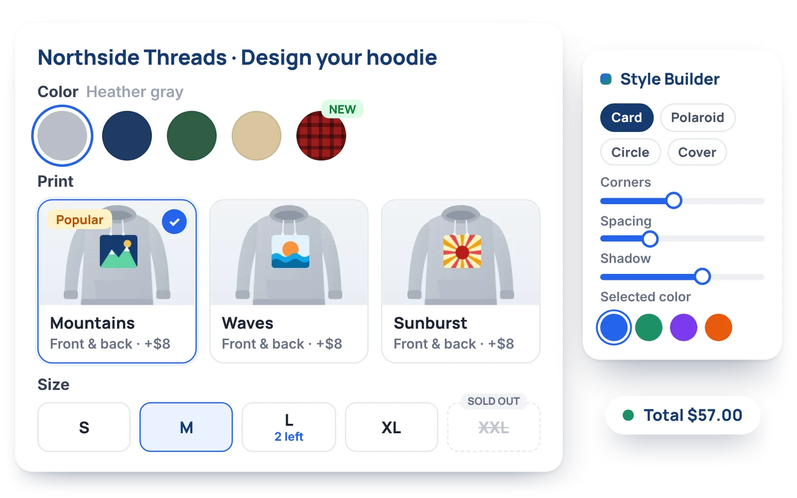
1. Turn on cards for the field
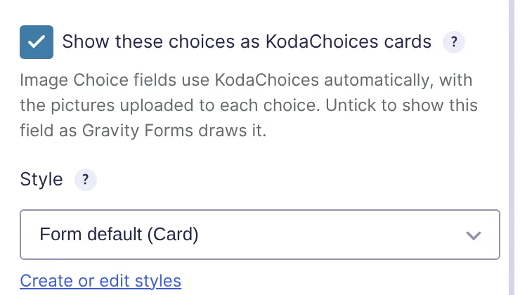
Open your form, click a Radio Buttons, Checkboxes or Multiple Choice field, and open the KodaChoices section in the field settings. Tick Show these choices as KodaChoices cards and pick a Mode: Image, Swatch, Icon or Button.
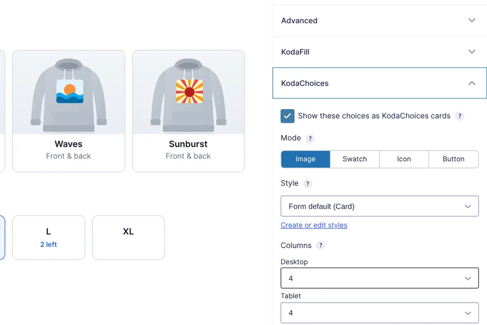
2. Give each choice a picture or color
In General → Edit Choices, each choice now has a Picture button (or a color or icon, depending on the mode). Pick or upload from the Media Library. For dozens of choices, Add pictures to many choices does them in one go.
3. Pick a style
Styles control the card shape, outline, shadow, picture shape and the selected look. A style is shared across the site, so change it once and every form that uses it follows. The Style Builder shows a live preview while you edit.
Already using Gravity Forms’ Image Choice field? KodaChoices takes those fields over automatically, using the images you’ve already uploaded. You can switch it off for one field or for the whole site.
Limit how many times a choice can be picked
This is where cards turn into a booking or ordering tool. Searches like “Gravity Forms inventory” and “limit choices” come from exactly this need: a workshop with 12 places, 6 rooms, 40 hoodies in medium.
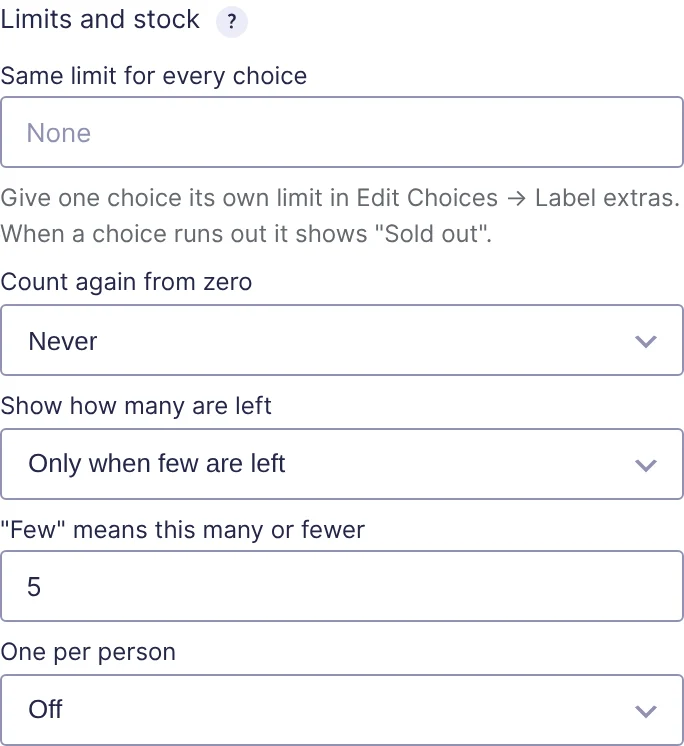
In the field’s KodaChoices section, open Limits and stock:
- Set one limit for every choice, or a limit per choice under its Label extras.
- Choose when to show how many are left: never, always, or only when few are left (“3 left”).
- When a choice runs out it shows Sold out, fades and can’t be picked.
- Optionally count again from zero every day, week or month, for daily sessions or monthly slots.
Every active entry counts toward the limit, and trashing an entry frees its place. The limit is checked again when the form is sent, so if someone else takes the last place while a visitor is still filling in the form, they’re told before anything is saved.
Quantities and one per person
Two related rules come up often:
- Quantities: let visitors pick how many of each choice they want (3 × Coffee). On a product Option field, the price is multiplied by the quantity and the form total updates live. A choice that only makes sense once, like gift wrap, can be set to always count as one.
- One per person: stop the same person choosing the same thing twice, such as voting twice or booking two places. Logged-in users are recognized by their account; other visitors can be recognized by an email field.
Product fields and prices
KodaChoices also works on Gravity Forms’ pricing fields. Products, options and shipping set to radio buttons, checkboxes or drop downs can all be cards, with each choice’s price shown on it. Prices are still worked out by Gravity Forms, so totals, order summaries and payment add-ons behave exactly as before.
Which route should you take?
- A one-off picture choice on a new form: Gravity Forms’ Image Choice field is fine.
- Choices side by side, nothing more: CSS ready classes will do it.
- Swatches, icons, stock counts, quantities or styled cards on fields you’ve already built: use KodaChoices.
Try the live hoodie-order demo, with every style, on the KodaChoices page, or read the KodaChoices docs.