
How to Style Gravity Forms Radio Buttons and Checkboxes
Updated November 10, 2026 · 3 min read
Radio buttons and checkboxes are the most-used fields in most forms, and the ones people most often want to change: side by side instead of stacked, in two or three columns, bigger and easier to tap, or as proper buttons that match the rest of the site.
This guide goes from the quick fixes Gravity Forms supports out of the box to fully styled choices without writing CSS.
What Gravity Forms can do on its own
- Form styles in the block. With the Gravity Forms block’s theme, you can set colours, the size of inputs and labels, and corner radius for the whole form from the block settings. That changes how radio buttons and checkboxes look, but not how they’re laid out.
- CSS ready classes. Add a class like
gf_list_2col,gf_list_3colorgf_list_inlineto the field’s Custom CSS Class setting (under Appearance) to lay choices out in columns or in a row.
Those two cover a lot of everyday needs. They don’t make choices look like buttons or cards, and phones get the same columns as desktops.
The custom CSS route
Anything beyond that is custom CSS: hiding the native circle, styling the label as a button, adding a selected state, hover and keyboard focus states, and media queries for phones. A typical “buttons instead of radio circles” snippet is 30 to 60 lines, and it has to be kept working through theme and Gravity Forms updates. Accessibility is easy to break along the way: if the real input is hidden the wrong way, keyboard and screen reader users can’t choose at all.
The no-code route: KodaChoices
KodaChoices turns Radio Buttons, Checkboxes and Multiple Choice fields into cards and buttons, with a visual Style Builder instead of CSS. The real inputs stay underneath, so the form submits, validates and works with the keyboard exactly as before.
1. Turn it on for a field
Click the field, open its KodaChoices section and tick Show these choices as KodaChoices cards. For plain text choices, set Mode to Button. Image, Swatch and Icon modes are there when a choice needs a picture, colour or icon.
2. Set the columns for each screen size
Columns has a setting for desktop, tablet and phone: Auto fits as many as the space allows, or pick 1 to 8 equal columns. On phones you can instead show one row people swipe through, with the next card peeking in at the edge.
3. Pick or build a style
Styles are shared across the site, so you design once and use the same look on every form. Start from a preset, then adjust it in the Style Builder with a live preview:
- Layout: picture above, beside or behind the text; alignment; spacing and padding.
- Card: background, corner curve (or fully round pills), outline and shadow.
- Selected look: colour, background, a tick, and how the outline changes.
- Text: size, weight and colour for labels, sub-labels and prices.
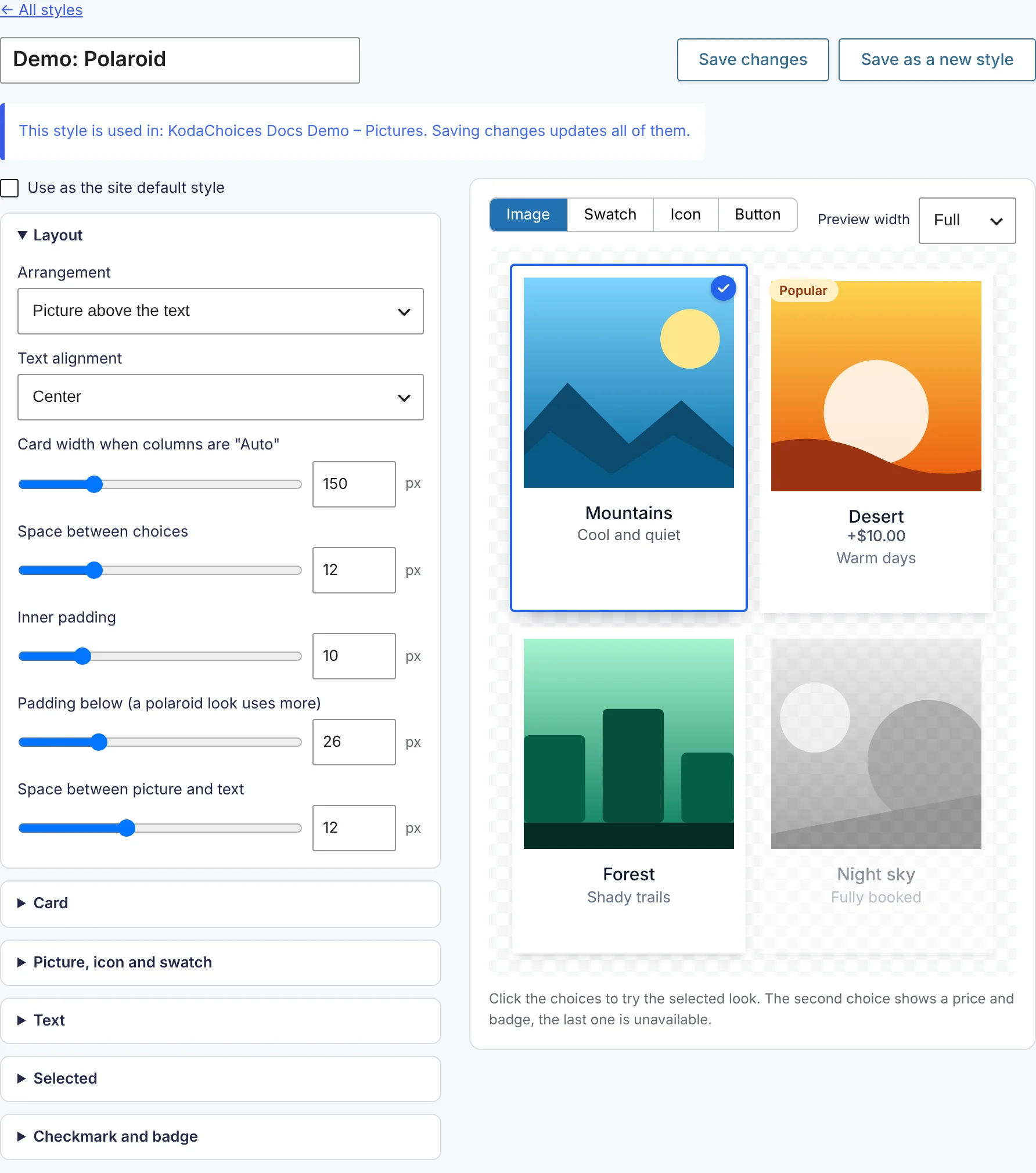
To tweak a few colours on one field without making a new style, use Colors for this field in the field’s KodaChoices section.
4. Add helpful extras
Each choice can carry a sub-label, a badge such as “Popular”, or a description that shows on hover. Long lists can get a search box and group headings. These make choices easier to scan without adding more fields.
Styles across many forms
Because a style lives in a shared library, changing it updates every field that uses it, on every form. Each form can have its own default style, and styles can be exported and imported to move them to another site.
Which route should you take?
- Choices in two columns or in a row: use Gravity Forms’ CSS ready classes.
- Matching your brand colours: the Gravity Forms block’s style settings.
- Buttons or cards, different columns on phones, or one look across many forms without maintaining CSS: use KodaChoices.
Switch between six style presets on a live form on the KodaChoices page, or read about Styles in the docs.