
How to Build a Multi-Step Gravity Form with Clickable Steps
Updated November 10, 2026 · 4 min read
Long forms lose people. An application, a quote request or an event registration that shows forty fields at once looks like work. Split into a few named steps, the same form feels quick, and people can see how far they have to go.
This guide covers Gravity Forms’ built-in multi-page forms, their limits, and how to get clickable step tabs, progress and a review step without code.
Multi-page forms in Gravity Forms
Gravity Forms can split a form into pages with the Page field:
- In the form editor, drag a Page field (under Standard Fields) to wherever a new page should start.
- Click Start Paging at the top of the form and choose a Progress Indicator: a progress bar, steps, or none.
- Give each page a name. The names show in the progress indicator.
- Save the form.
Each page has Next and Previous buttons, required fields are checked when Next is clicked, and you can use conditional logic on a Page field to skip a page.
Where built-in pages fall short
Built-in pages are fine for a simple split. These are the things people usually go looking for next:
- Bar or steps, not both. The progress indicator is one or the other.
- Visitors move with Next and Previous. The step names show where you are, but they aren’t links visitors can use to jump to a page.
- Every page change is a round trip. Moving between pages posts the form to the server and waits for the next page, which feels slow on a phone.
- Limited looks. Tabs, a sidebar of steps or an accordion means custom CSS and markup.
- No review page. Showing answers back before submit means building it yourself with HTML fields and merge tags.
The no-code route: KodaSteps
KodaSteps uses its own Step field instead of page breaks. A step runs from one Step field down to the next. All steps are part of one form on one page, so switching between them is instant, and Gravity Forms still checks every field when the form is submitted.
1. Add Step fields
Open your form, then drag a Step field from Advanced Fields to the very top. Change its label to the step’s name, for example “Your details”. Add another Step field wherever the next step starts, and so on. In the editor each step gets its own colour band and a field count.
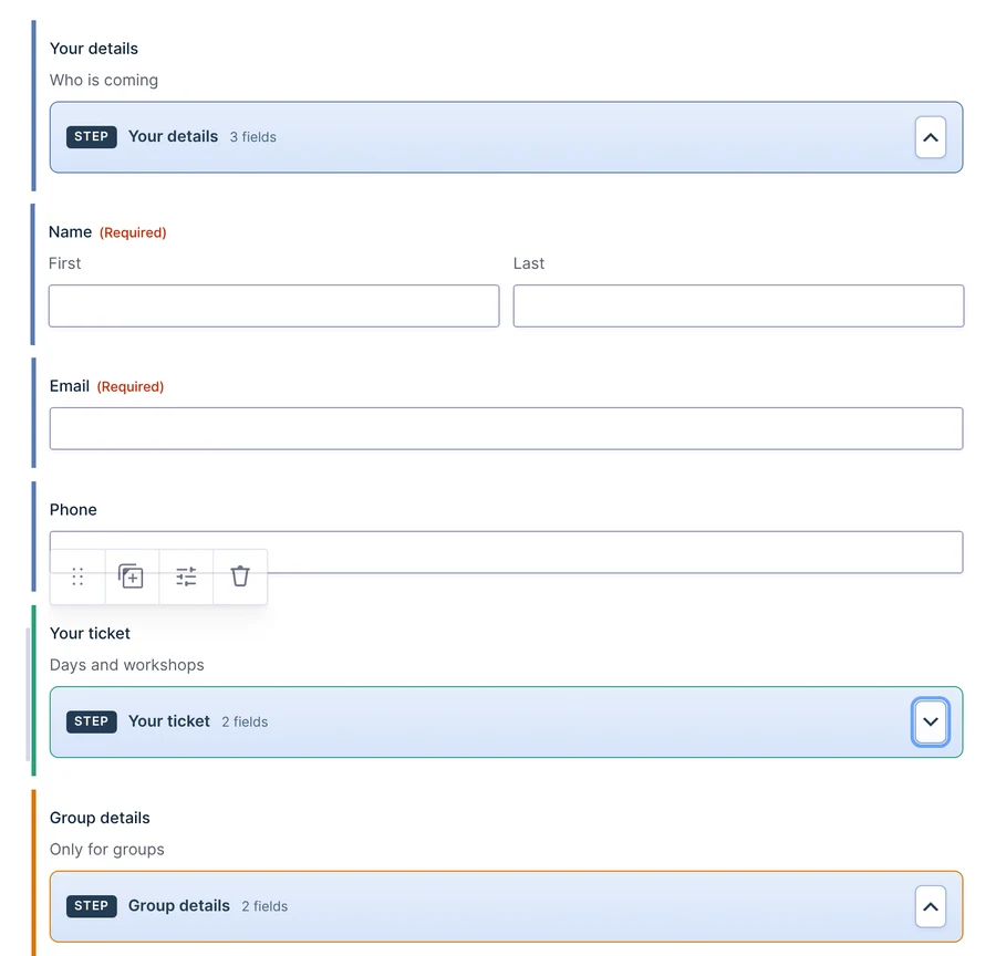
A form uses either KodaSteps Step fields or Gravity Forms Page fields, not both. If you’re converting a multi-page form, replace its Page fields with Step fields.
2. Choose the layout and look
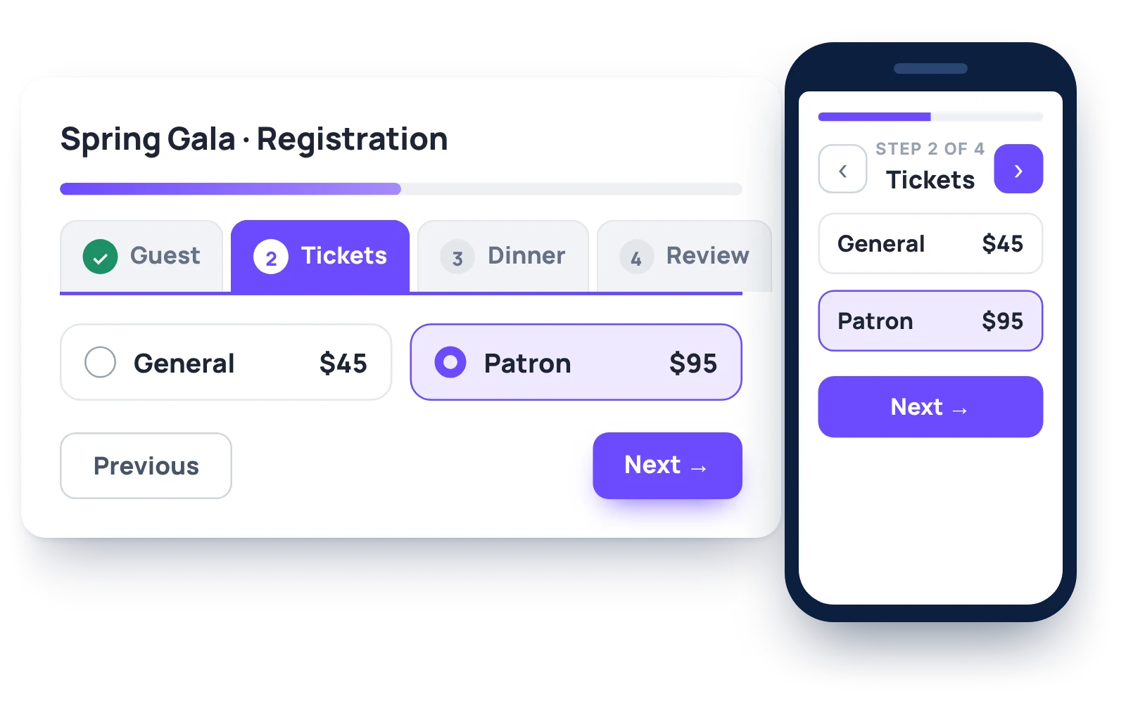
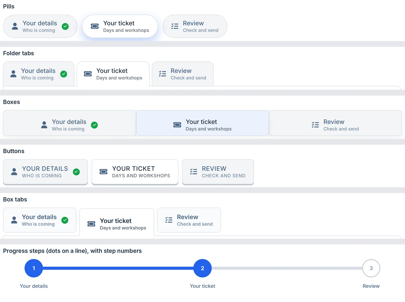
In the form’s Settings → KodaSteps, choose where the steps go: across the top, down the left or right side, or as an accordion where each step opens in place. Then pick a step style: pills, folder tabs, boxes, buttons, box tabs or progress dots on a line. A live preview updates as you change settings, with a phone view.
3. Decide how people move between steps
- Free (the default): visitors can click any step at any time. Everything is still checked on submit.
- In order: later steps unlock as earlier ones are done, and locked steps are greyed out.
- Check each step on Next: on by default, so missing required fields are caught step by step.
Each step can show its progress, either as an answered count like 3/5 or a dot that fills when the step is complete. Finished steps get a tick, and steps with errors get a red mark.
Add a progress bar
KodaSteps can show a progress bar above the steps as well as the step tabs, so you don’t have to choose between them. You can set its style, thickness, colours and an icon.
Add a review step before submit
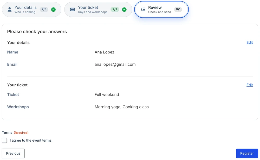
A review step lists every answer from the earlier steps so visitors can check them before they send. Add a Step field at the end, name it “Review”, and tick Review step: show a summary of all answers.
Each step heading and each answer has an Edit link that jumps back to that field. Passwords and payment details are never shown, and anything below the review Step field, like a consent checkbox or a signature, appears under the summary.
Show a step only when it applies
Use Gravity Forms conditional logic on a Step field to show or hide the whole step, for example a “Group details” step only when Ticket is Group. A hidden step leaves the step bar, the progress count and the review step, and its fields are treated as hidden by Gravity Forms: not required, not checked and not saved.
Which route should you take?
- A two- or three-page form with a simple progress bar: Gravity Forms’ Page field does the job.
- Clickable tabs, instant switching, a side or accordion layout, a review step or a proper phone layout: use KodaSteps.
You can switch styles, layouts and colours on a live job application in the KodaSteps demo. Every setting is explained in the KodaSteps docs.